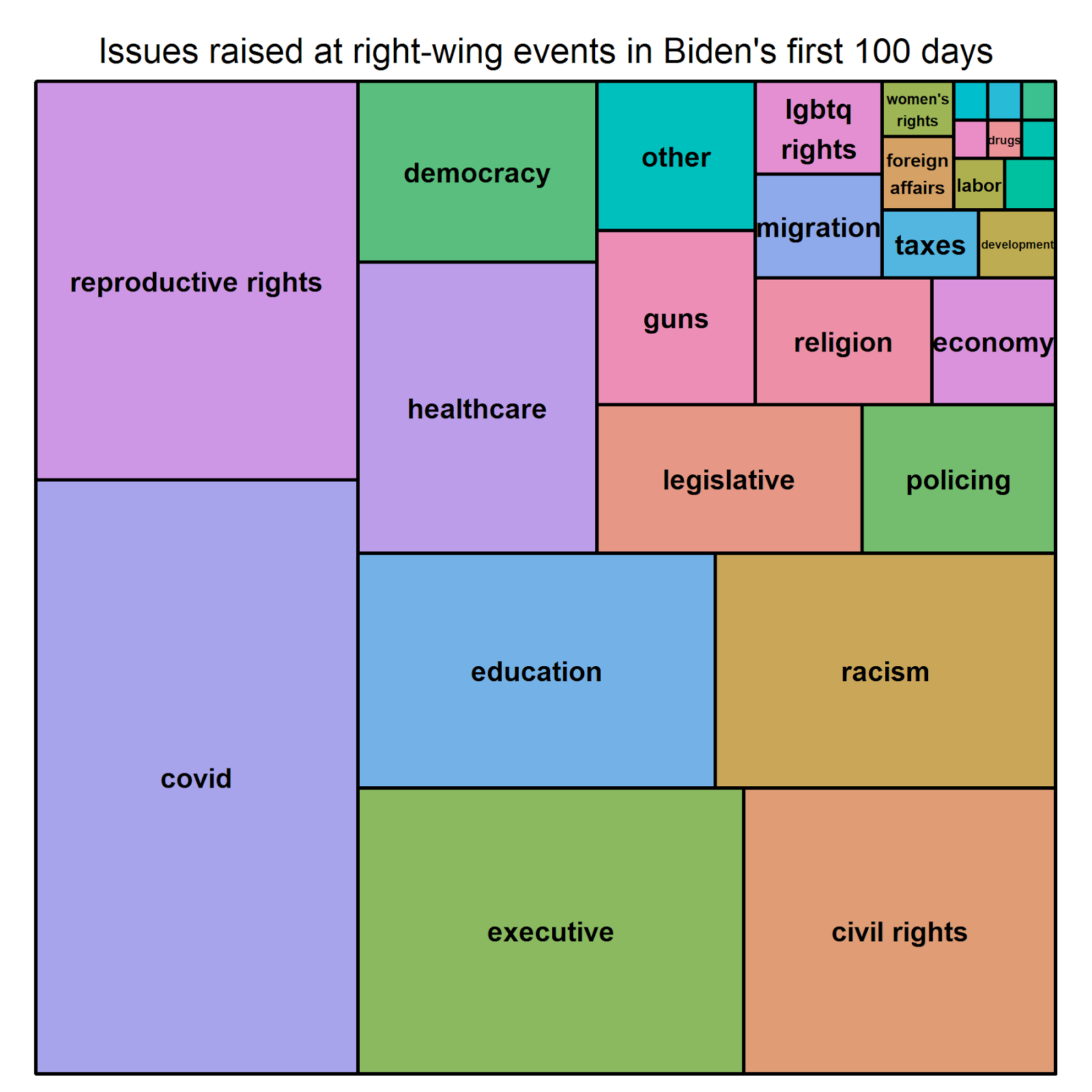
Contours of the George Floyd Uprising

We all know that the killing of George Floyd by Minneapolis police officers on May 25, 2020, triggered a tsunami of protest activity across the United States.

Just how large and broad was that wave of protests, though? How destructive was it? And how did police and right-wing counter-protesters respond to it?

The Crowd Counting Consortium’s dataset represents one of the most comprehensive sources on U.S. protest activity over the past four years, including the George Floyd uprising. I’m going to use that dataset to answer the questions I just posed in a moment, but I want to preface this exercise with three caveats.

  • First, as the late Will Moore observed, no event data set at this scale can ever be complete, and CCC’s is no exception. With generous help from Count Love, we record every relevant event we find, and we believe our search strategy is thorough. Still, we can’t catch everything that gets reported anywhere, and we know that some events don’t get covered by news outlets or on social media at all (more on that in a future post, I think). As a result, we know the true number of relevant events is always going to be larger than what we (or any similar project) can capture.
  • Second and related, we know that our data on crowd sizes at protest events generally undercounts the true number of participants as well. A non-trivial fraction of the events in our dataset have no information about crowd size because none was reported and no pictures or videos were available to estimate it. When we sum crowd sizes across events, these missing values effectively become (inaccurate) zeros. What’s more, when crowd sizes are described with vague words, we err on the conservative side and convert those to the lowest relevant value. For example, “dozens” becomes 24, or “hundreds” becomes 200. Again, the net effect is to shrink the overall estimates of participation in protest activity toward the low end of the true value or range.
  • Third, our data collection for 2020 is ongoing, so these numbers are subject to change. In particular, we are still working to clear a backlog of candidate events from August and September, so apparent declines in protest activity during that time are, at least in part, an artifact of this aspect of the data-making process.

Okay, so, with those important caveats attached, what do the data we’ve collected so far tell us about the contours of the George Floyd uprising?

For starters, we can confirm that it has been massive. CCC’s dataset includes nearly 12,000 anti-racism events in the U.S. since May 25, 2020, or nearly 20 percent of all protest events in the country over the past four years. By our (conservative) count, those events involved roughly 2.7 million participants, and, for the reasons noted above, the true number is surely much higher.

In addition to its sheer size, a key feature of the George Floyd uprising was the pace and breadth of the spread in activity associated with it. So far, CCC has recorded anti-racism events in an astonishing 3,113 different U.S. cities and towns since Floyd’s death. Remarkably, more than 2,800 of those localities saw anti-racist activism in just the four weeks after May 25.

As that number suggests and as the chart below shows, activism in support of the Black Lives Matter message diffused quickly. The wave peaked on Saturday, June 6, just two weeks after Floyd was killed, with more than 700 events in over 600 different cities and towns. The next day saw another 518 events in more than 400 localities. The wave gradually receded over the ensuing several weeks, eventually settling into a pattern in many cities that involved daily or weekly marches and demonstrations with fewer participants than that initial surge but a persistent focus on calls for racial justice and Black empowerment and opposition to police violence.

We can also use maps to visualize the speed and breadth with which the George Floyd uprising spread across the country in May and June. The gif below animates a sequence of maps from May 26 to June 30, 2020. In those maps, each point represents an anti-racism protest, and the size of the point is crudely proportionate to the size of the crowd. (Events with no reported crowd size get the same-sized point as events with tens of participants, and apologies to Alaska and Hawaii for leaving them out).

Now, how destructive was the George Floyd uprising?

If you follow right-wing news outlets or listened to many Republicans’ stump speeches last fall, you have heard that the Black Lives Matter protests of the past eight months have been exceptionally destructive. The CCC dataset does not capture the scale of destruction associated with protest events, but it does indicate whether or not any property damage occurred, including minor vandalism such as broken windows or graffiti as well as larger-scale damage or looting.

By that measure, nearly all events associated with this uprising were not destructive at all. More than 96 percent of the nearly 12,000 events in our dataset involved no reported property damage. As the chart below shows, the vast majority of the events that did involve property damage occurred in the uprising’s initial wave in May and June 2020; since then, reports of property damage associated with anti-racism protests in the U.S. have been extremely rare.

And what does the CCC dataset tell us about how police responded to these events?

As with property damage, we can’t readily quantify the intensity of the response from police and political rivals, but we can say some things about the frequency with which they took certain actions.

  • According to our data, police arrested protesters at nearly 7 percent of these roughly 12,000 events, including nearly two-thirds of the events involving any property damage.
  • The CCC data also show that police used tear gas or other chemical irritants such as pepper spray or pepper balls on protesters at 292 of those events, or nearly 2.5 percent of them. In only 56 percent of those 292 events did we also see any property damage or police injuries, leaving at least 126 events where chemical irritants were used against people who were protesting without damaging property or harming police.
  • We also saw reports of protester injuries at 288 (2.4 percent) of these events. That’s substantially higher than the 172 (1.4 percent) of events that involved any police injuries, and most (212 of 288, or 74 percent) of the events with protester injuries did not involve any police injuries. What we can’t say for sure without digging back into the source material for those records is whether those protester injuries were caused by police, counter-protesters, or something else.

Finally, what about those counter-protesters?

One notable feature of the George Floyd uprising was the backlash it inspired, not just from police but also from other civilians. CCC data capture this backlash in several forms, including the rapid growth of the Back the Blue counter-campaign over the summer of 2020 and the increased frequency with which far-right militant groups organized or participated in protests and other demonstrations or direct action over the latter half of the year.

One of the most obvious manifestations of this backlash, though, were the direct counter-protests that occurred at many events—cases where people gathered at demonstrations calling for racial justice for the specific purpose of rejecting or rebutting their anti-racism message. So far, we’ve recorded 245 of those since May 25, 2020, and that is almost certainly a low estimate, as counter-protesters did not always reference racism in their claims (or coders did not record them as such).

As the chart below shows, while the rate at which these counter-protests occurred generally follows the same trajectory as the George Floyd uprising, they have tapered off more slowly. Some of these counter-protests ostensibly focused on the protection of property, especially early in the uprising, when images of rioting in dominated coverage of anti-racist activism; many expressed support for police officers and law enforcement, sometimes but not always mixing that message with support for President Trump; and some led to violent or even fatal confrontations.

In sum, CCC data confirm that the wave of anti-racism protest activity following the killing of George Floyd has been massive and widespread; has very rarely been destructive; and has spurred backlashes in the forms of aggressive policing and right-wing counter-mobilization. 

We’ll dig deeper into the data on mobilization and counter-mobilization around racism in the U.S. in future posts. Meanwhile, if you’d like to replicate or expand on this analysis, you can find the R code used to generate the charts in this post in the Nonviolent Action Lab’s GitHub repository, here.

Trump-Era Themes in U.S. Protests

Under the Trump administration, what did Americans protest about?

The Crowd Counting Consortium’s compiled dataset offers a few ways to answer this question. Each of the more than 61,000 records in the dataset so far represents a separate event, and each of those records includes a field summarizing what the event was about, as understood and recorded in words by CCC’s human coders.

One of the simplest ways to try to spot patterns in those claims is to break them into individual words; toss all those words into one metaphorical bag; count the number of times each word appears in that bag; and then compare those counts.

The word cloud below shows what happens when we do just that. In the cloud, word position is essentially arbitrary, but the size of each word represents its relative frequency, so more common terms appear larger. Words that don’t have political meaning, like “the” and “of”, were dropped before the tallying; plural forms were singularized; and words that occurred fewer than 10 times have been dropped the figure.

I think the resulting image does a nice job highlighting major themes in protest activity under Trump. For example, the Black Lives Matter that began in 2020 is probably the broadest and widest mobilization in U.S. history, so it’s no surprise to see “racism”, “police”, “violence”, and “brutality” pop out of the cloud. Meanwhile, the tsunami of student walkouts after the Parkland attack in 2018 represents the broadest single-day event in U.S. history—walkouts occurred at nearly 5,000 institutions across the country—and we see traces of those events and similar ones in “gun”, “control”, and “school”. The latter also gets a boost from COVID-related protests, many of which have argued for or against resuming in-person learning or school sports during the pandemic.

Unfortunately, this simple word-counting approach doesn’t work so well at the level of individual events, or for tracking trends in protest themes over time. To do those kinds of things, we need to move up a rung or two on the ladder of abstraction, reducing and structuring the data even further.

We accomplish this in the compiled version of the CCC dataset by associating each event’s claims with recurrent issues in American politics. When compiling the data, we also run the coder’s summaries of protesters’ claims through a series of regular expressions representing nearly 35 major political themes—things like ‘racism’, ‘education’, ‘guns’, ‘reproductive rights’, and, since 2020, ‘covid’. Each regular expression, or regex, looks in the Claim field for a set of words or phrases associated with the issue in question and, if it sees any of them, attaches a tag for that issue to that event.

Once those issue tags have been attached, we can use them to group or filter events for analysis. The simplest thing to do at this point is just to count the number of times each tag appears in the data.

The column chart below shows the results of that exercise for the 60,000+ events that occurred during the Trump presidency. Consistent with the word cloud, we see that racism, policing, guns, and education (schools) were the most common themes of U.S. protest activity over the past four years. Now, however, we can also see more clearly the prominence of other recurrent issues such as immigration, the environment, women’s rights, democracy (including voting rights), COVID-19, and the presidency and Trump himself (“executive”).

To see how activism around those themes has trended over time, we need to group events by time step as well as issue. The set of small multiples below does that, grouping here by month. Because the ranges of daily counts vary so widely across issues—some peak in the thousands, others in the tens—I’ve chosen not to standardize the scale of the y-axis across the charts, but the x-axes all span the same time period. The charts are arranged alphabetically by issue tag.

There’s a lot going on in that stack of charts. Picking just a few to focus on, though…

  • Each of the annual Women’s Marches shows up as a peak in the “women’s rights” chart, including the batch held in October 2020, ahead of the presidential election.
  • Ditto for the Fridays for Future climate strikes, which produce a series of clear peaks in the “environment” chart.
  • The March 2018 National School Walkout in response to the Parkland shootings was so massive that the peaks it produces on the “guns” and “education” charts drown out the rest of the variation over time for those plots. We see a hint of the uptick in school-related activism in the COVID era on the “education” chart, but you have to know to look for it to spot it.
  • The “economy”, “housing”, and “labor” charts all show broad increases in protest activity around those themes at the tail end of the Trump presidency, when the coronavirus pandemic set off a historic decline in the U.S. economy. Schools have been one focal point of COVID-related activism, but frustrations over business closures, demands for safer workplaces, and calls for cancelling rent and evictions have also figured prominently in this wave.

Together, these three charts offer a solid high-level overview of major themes in protest activity under the Trump administration. I also hope this post shows some of the ways the CCC dataset can be used to identify and analyze patterns in U.S. activism at various levels of abstraction, from reading a news story about, or even watching video footage of, a specific event (see the links in the ‘source_’ columns of the compiled dataset), to reading CCC coders’ summaries of protester claims, to using natural language processing techniques to summarize those summaries into features we can tally and compare at higher levels of abstraction.

If you’d like to replicate or expand on the analysis described in this post, you can find the R code used to generate these charts in the Nonviolent Action Lab’s GitHub repository, here.

Hello, World!

Welcome to the blog of the Crowd Counting Consortium, a.k.a. CCC.

CCC is a public-interest and scholarly project that documents political crowds in public spaces in the United States. CCC emerged in early 2017 from an improptu collaboration between Professors Erica Chenoweth (Harvard University) and Jeremy Pressman (University of Connecticut), who both found themselves that January trying to collect data on participation in the inaugural Women’s March.

Over the following four years—and with much help from Count Love and a bevy of research assistants and volunteers—CCC’s database has grown into one of the most comprehensive, freely available sources of near-real time information on protests, marches, demonstrations, strikes, and related political gatherings in the contemporary U.S. By the end of the Trump era on Inauguration Day 2021, the project had collected and shared structured data on roughly 60,000 distinct events in all 50 states, the District of Columbia, and the territories of Guam, Puerto Rico, and the U.S. Virgin Islands.

Numerous academic and press pieces have used CCC data, including a 2018 article in the journal Mobilization on trends in U.S. protest activity between the first and second Women’s Marches; a 2020 New York Times story on the historic scale of the Black Lives Matter uprising; and a 2021 Los Angeles Times piece on protest activity in California under Trump. The Consortium has also published multiple pieces in the Washington Posts Monkey Cage forum, including a June 2020 post on the geographic breadth of the George Floyd protests and a February 2021 post offering an overview of U.S. protest activity in the Trump era. In 2020, we also launched a GitHub repository, where we share a compiled and augmented version of the data posted in monthly chunks on CCC’s data page, and a data dashboard that lets users visually explore and interact with the data.

With this blog, we aim to do three things.

  • First, we hope to provide insight into trends in contentious politics in the contemporary U.S. through data visualizations and short write-ups on things we discover as we generate and explore the data ourselves.
  • Second, we hope to familiarize a wider audience with CCC’s data and the ways it can be used in scholarly research and data journalism. If you think our posts are insightful, please share them with your colleagues and friends.
  • Finally, by sharing the code we use to explore and analyze the data and to generate visualizations, we hope to make it easier for other scholars and journalists to use CCC data and follow through on their own ideas.

So, that’s where we’re going. No formal schedule, no paywall—just a desire to squeeze more value out of this tremendous resource, which we think we’ve only begun to tap. See you again soon.